
Widgets Guide
Complete Customer Documentation for Creating, Managing, and Displaying Widgets in Synoptix

Introduction
Widgets are a new personalization feature in Synoptix 11 that allows users to display important report-based information directly on the Launch Page.
Widgets bring charts and report-driven insights directly onto the Launch Page, making it easier to keep important information visible without opening the same reports over and over again. New widget options will continue to expand Launch Page customization over time, but the two main widget types available at launch are One Component Graph and Two Component Graph.
1. Widgets in Synoptix
Widgets are visual components that display report-driven information on the Synoptix Launch Page.
Depending on the widget type and selected report, a widget can be used to:
- highlight a KPI or summary metric
- display a graph or chart from report data
- compare values or trends over time
- keep important operational or financial information visible without opening a report first
Widgets are especially useful for recurring information that users want to review often. Rather than treating the Launch Page as a simple starting screen, widgets make it possible to turn it into a more active, decision-ready workspace.
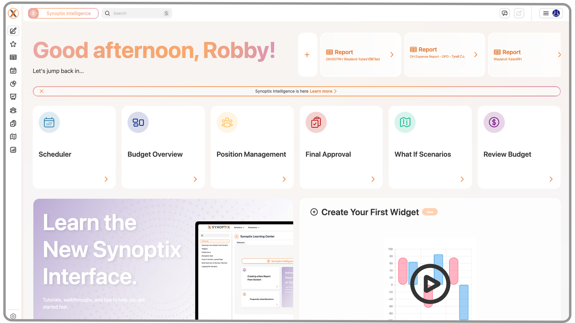
2. The Launch Page
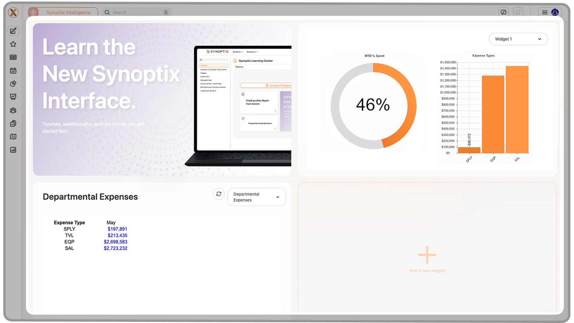
Widgets are displayed on the Launch Page.
On the Launch Page, widgets appear as tiles that can be used alongside other personalized features such as recent reports and Quick Links. Once a widget is created, it can be selected and placed into one of the widget spaces available on the page.
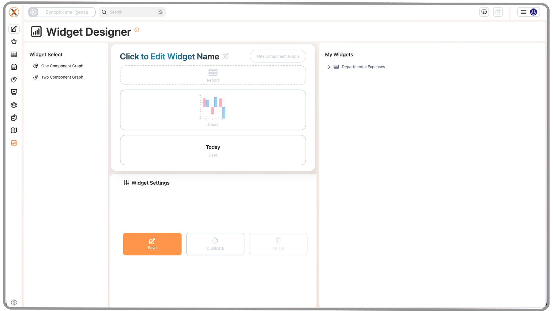
3. The Widget Designer
Widgets are created and managed in the Widget Designer, which is available from the left-hand navigation menu.
The Widget Designer is the main workspace for:
- selecting a widget type
- naming a widget
- choosing the report the widget will use
- selecting a chart style when chart output is available
- defining the date or run period for the widget
- configuring refresh behavior
- saving and reviewing created widgets
4. Widget Designer Interface
The Widget Designer is organized around a few core areas that work together during setup.
4.1 Widget Types Panel
On the left side of the Widget Designer, users will see a list of available Widget Types.
This area determines the overall structure and behavior of the widget being created. Each widget type supports a particular layout and may expose different display options depending on how the widget is designed to present information.
At launch, the available widget types are:
- One Component Graph: displays a single, centered chart
- Two Component Graph: displays two components within the same widget
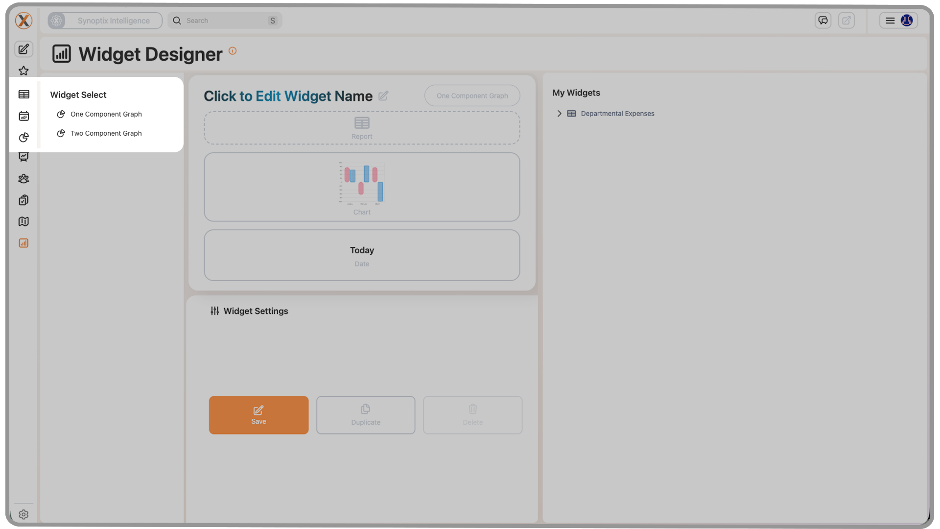
For many first-time widget setups, a One Component Graph is a common starting point because it focuses on one visual or metric at a time.
4.2 Preview Area
The center portion of the Widget Designer displays the widget settings and configuration areas used during setup.
This is where users interact with the widget being built and where major fields such as the title, report, and chart type are displayed.
4.3 Widget Settings Panel
When users interact with configurable fields inside the preview, the Widget Settings panel displays the options relevant to that part of the widget.
For example:
- selecting the Report field shows the reports available for widget use
- selecting Chart Type shows the chart styles available for the selected report
- selecting date-related options allows the widget run period to be defined
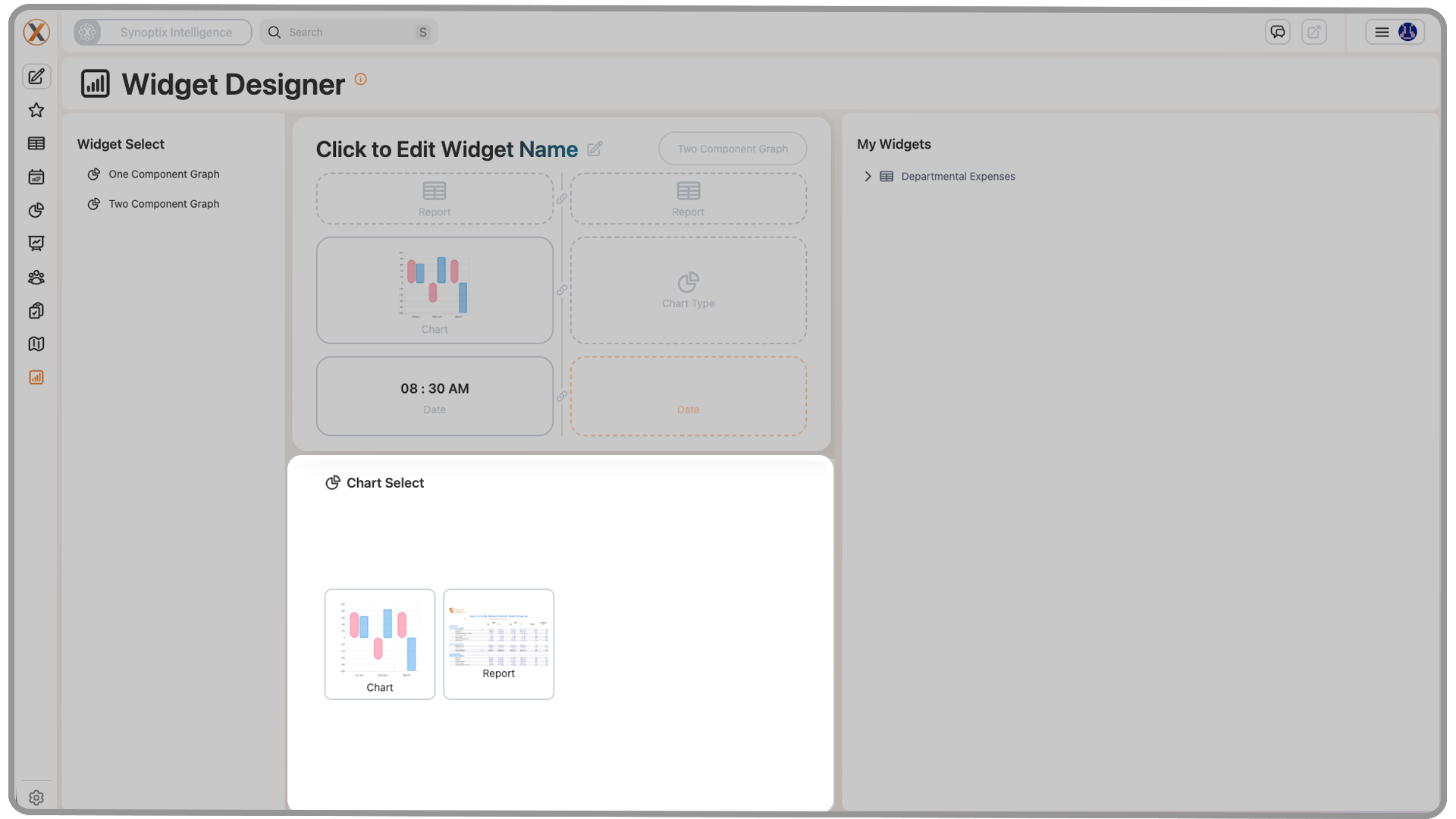
This means the Widget Settings panel changes context depending on what part of the widget is currently being configured.
4.4 My Widgets Panel
After a widget has been saved, it appears in the My Widgets panel.
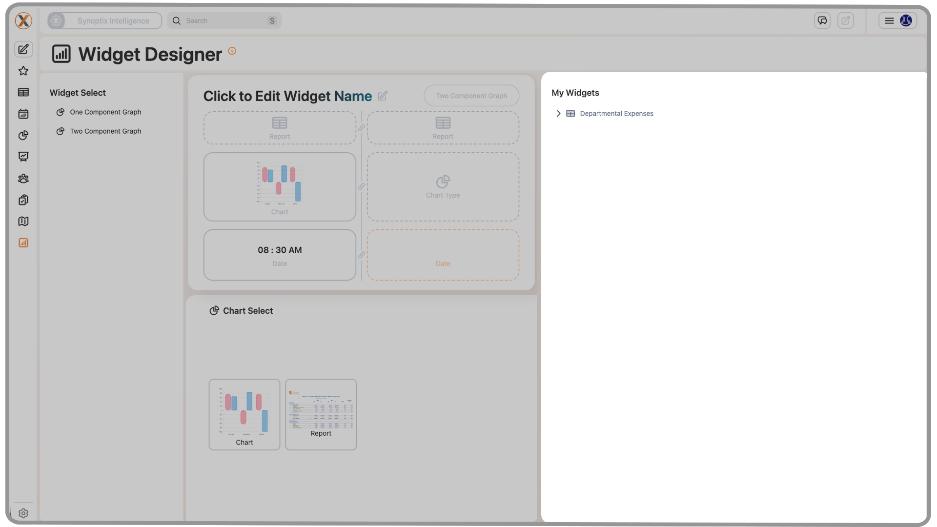
This panel acts as a library of saved widgets that are available for reuse. It allows users to keep building widgets over time and then select from previously created items when updating the Launch Page.
5. Widget Fields and Controls
The widget creation process is driven by a small set of important fields and controls. Each one affects either the data the widget displays or how it behaves on the Launch Page.
5.1 Widget Type
The Widget Type defines the layout and display structure of the widget.
This is the first major decision in widget creation because it determines how the information will be presented. Different widget types may support different visual arrangements, but they all serve the same basic purpose: taking report data and presenting it in a Launch Page-friendly format.
5.2 Title Field
The title field appears at the top of the preview area and allows users to name the widget.
This title is important because it becomes the label users rely on when scanning the Launch Page. Short, clear names work best, especially when multiple widgets are displayed together.
Recommended best practice:
- use concise names
- choose names that describe the metric or report being displayed
- avoid overly long labels that may be harder to scan quickly
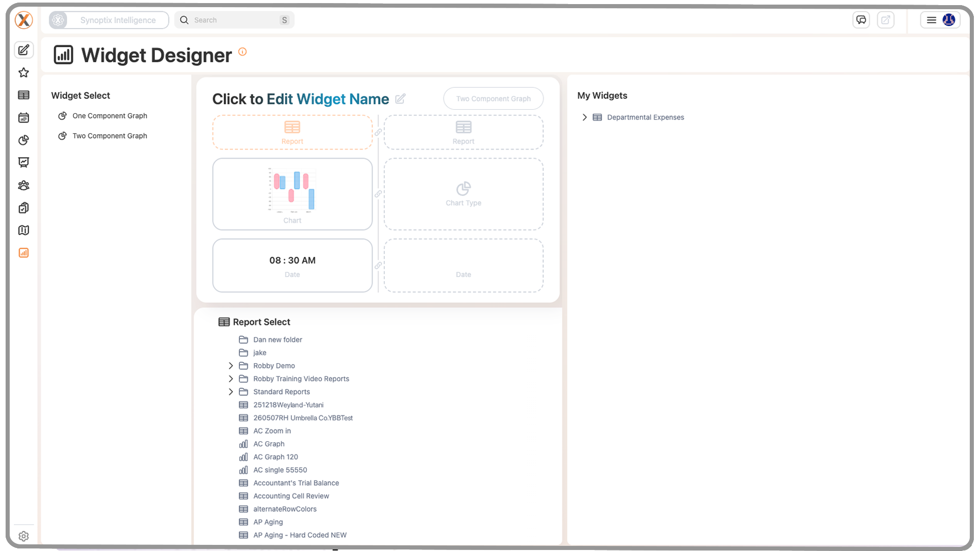
5.3 Report Field
The Report field determines which report the widget will use as its data source.
When a report is selected, it becomes the data source for the widget. This is one of the most important fields in widget setup because the selected report controls what information can be visualized.
The report chosen here affects:
- which data is displayed
- which chart types become available
- how useful the widget will be in practice
In other words, the widget is only as useful as the report behind it.
For graph-based widgets, the report list is not simply every report in Synoptix. Graph widget types should use reports that already have graph properties defined. This ensures the widget has compatible chart information available during setup.
If a report has not been set up for graph output, it may not be available for use as a graph widget. To learn how to prepare a report for graph-based use, see How to Set Up Graph Properties in Synoptix.
5.4 Chart Type
The Chart Type field allows users to choose how the selected report data should be visualized.
Available chart types depend on the selected report and its configured graph output. If the report supports chart-based display, Synoptix presents the chart styles that are valid for that report.
Common behavior to understand:
- changing the report can change the available chart types
- the chart style determines how the same underlying data is presented
For example, a bar chart may be ideal for monthly comparisons, while other chart types may be better suited for trend or summary display.
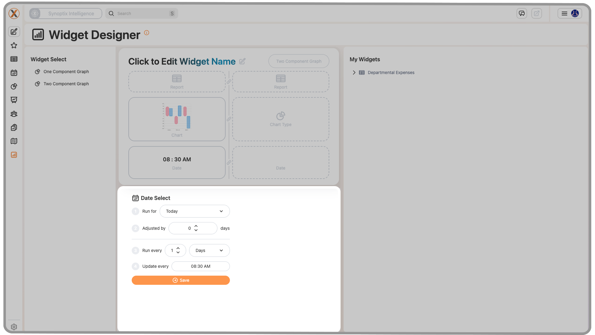
5.5 Date Selection
The Date field determines what period the widget runs against.
This setting matters because it controls the timeframe represented by the widget. A widget configured for an end-of-month view may produce a very different result than one configured for another date selection.
This helps users align the widget with the rhythm of the data they want to monitor.
The widget date selection may support different date modes depending on the widget setup. Current documented behavior includes options such as:
- running once
- running on a recurring schedule
- running for a selected date
- running for the end of last month
When a selected date is used, the chosen date is shown in plain-English form so the widget timing is easier to understand at a glance.
5.6 Refresh or Schedule Setting
Widgets may also allow refresh behavior to be configured.
In simpler setups, users may leave the widget set to run Once. In other cases, automatic refresh behavior may be used so the widget updates over time without manual intervention.
This option is especially useful when the widget is meant to track information that changes regularly and needs to stay current on the Launch Page.
For scheduled widgets, the interface may also present a plain-English description of the selected schedule. This helps users confirm the timing without needing to interpret a technical schedule format.
5.7 Save
The Save button finalizes the widget configuration.
After saving:
- the widget is added to the My Widgets panel
This is what turns the in-progress configuration into a reusable widget that can be placed on the Launch Page.
The internal product notes also suggest that the Save action is intentionally gated until the widget has the minimum required configuration. In practice, this means users may not be able to save a widget until the required setup steps, such as choosing the relevant date behavior, are complete.
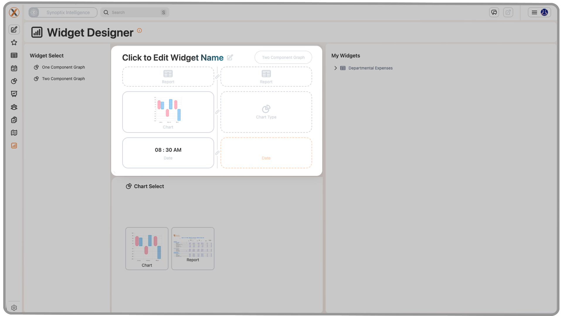
5.8 Link Buttons Between Components
Some widget types can include more than one component. In those multi-component layouts, link buttons may appear between the two components to connect them as part of a single widget experience.
These link buttons are used to make a setting on one component match the same setting on the other component.
When documenting or training on multi-component widgets, users should understand:
- link buttons are specific to widget types that support multiple components
- they appear between the components rather than inside a single chart or metric area
- they can be used to keep the two components aligned
- they can match settings such as date, report, and graph type across both components
Because these controls are specific to multi-component widget layouts, users creating a simple single-component widget may never encounter them.
6. How Widgets Work with Reports
Widgets depend on reports for their data.
This means widget behavior is closely tied to the report selected during setup. If a report has a chart-ready output and a compatible graph configuration, the widget can display that information visually. If not, the widget options may be more limited.
Because of this relationship, users should understand that widget setup is not completely isolated from report design. Reports and widgets work together.
6.1 Graph and Chart Availability
The chart styles available inside a widget depend on the selected report's graph properties.
If a report has not been configured to support the chart style a user wants, that option may not appear in the widget setup process. In practice, this means the widget reflects the visual capabilities already enabled in the source report.
6.2 Multi-Component Widgets
Some widgets go beyond a single chart or metric and are designed to include multiple components within the same widget layout.
These multi-component widgets are useful when related pieces of information need to be displayed together. Rather than asking users to create two completely separate widgets, Synoptix can keep those related elements connected inside one widget design.
In these cases, users may see:
- separate component areas within the same widget
- additional configuration choices beyond a basic single-component setup
- link buttons between components that help tie the widget together
This makes multi-component widgets more advanced than the introductory widget examples and may require more deliberate planning when selecting reports, layout structure, and visual relationships.
7. Saving, Running, and Reusing Widgets
After a widget has been configured, saving it makes it available for ongoing use.
Once saved, the widget is added to the My Widgets panel, where it can be selected again later. This allows users to gradually build a reusable library of widgets rather than recreating them from scratch each time.
Over time, this supports a more flexible workflow where users can rotate widgets in and out of the Launch Page based on current priorities.
8. Adding Widgets to the Launch Page
After a widget is saved, it can be added to the Launch Page.
The current training materials show two main ways this can happen:
- replacing an existing widget tile
- adding a new widget tile
8.1 Replacing an Existing Widget Tile
If users want to swap out a widget that is already displayed, they can hover over the existing tile and use the dropdown menu in the upper-right corner of that tile.
From that menu, they can choose a different widget from the available options.
This allows users to update the Launch Page without changing the entire layout.
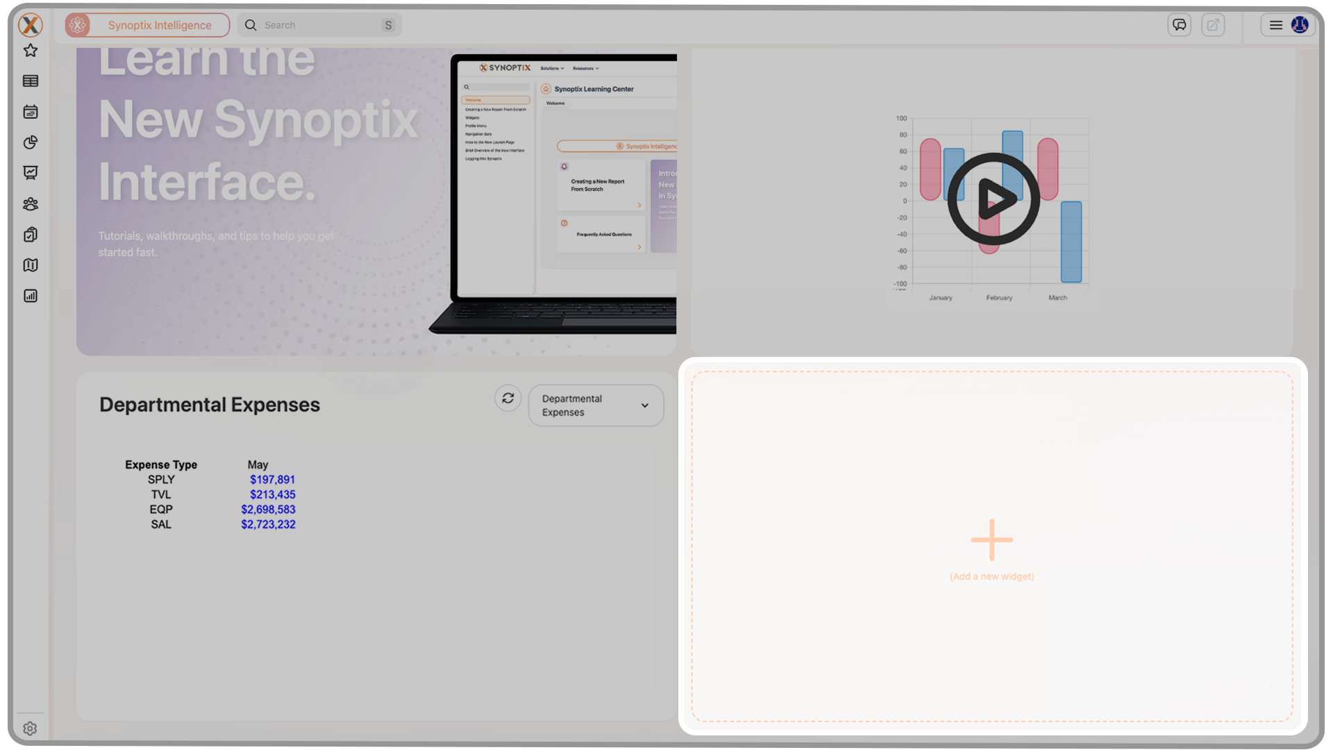
8.2 Creating a New Widget Tile
Users can also add a fresh widget tile by selecting the large plus sign labeled Create a New Widget.
From that dropdown, they can select one of their saved widgets and place it onto the Launch Page as a new tile.
This is useful when users want to expand the amount of information visible on the Launch Page rather than replacing an existing widget.
9. Interacting with Widgets on the Launch Page
Once a widget is displayed on the Launch Page, it becomes part of the user's normal home screen experience.
Each widget on the home page includes three main interaction options:
- Refresh: runs the widget again using the most current information available for that widget
- Drill Down: opens the report behind the widget so users can move from the summary view into the underlying detail
- Dropdown Menu: provides options to change, duplicate, or delete the widget
These options make widgets more than static displays. Users can refresh them for updated information, move into the supporting report for more detail, or manage the widget directly from the Launch Page.
In day-to-day use, this allows widgets to act as both a quick-view dashboard element and a starting point for deeper analysis.
10. Key Takeaway
Widgets are designed to bring your most important information to the surface. They give users a way to turn the Launch Page into a more personalized, role-specific dashboard by combining report data with visual presentation and easy access.
When used well, widgets reduce clicks, improve visibility, and make Synoptix more useful from the moment you log in.
Synoptix Logo
Acts as a Home button, returning you to your Launch Page.
Pin Tab
Lets users choose whether new content opens in a new tab or replaces your current tab.
Create New
Opens a small window to create a new workspace or report.
Favorites
Expands to show your ten most recent reports and any items marked as favorites.
Reporting
Lets you search, filter, and access all reports, graphs, and packets.
Scheduler
Automates report generation and distribution across your organization.
Dashboard Designer
Create and customize your own dynamic dashboards.
Budgeting & Forecasting
• Budget Overview
• Budget Templates
• Position Management
• Final Approval
• What-If Scenarios
Access the full budgeting suite including:
Displays your full budget structure and progress at a glance.
Shows all templates by budget year and version.
Manage positions within your budgeting model.
Review and finalize budgets before submission.
Run hypothetical forecasts for planning flexibility.